Quick progress update 11/2

Hi everyone, just posting a general update on how things have been going the past week or two, dev-wise.
Last week's Kickstarter news was really big! About a week went into working on all the art and some other behind-the-scenes stuff, so it was only this past weekend I got back in to some dev tasks.
I have about one more week before I'm in total moving prep crunch lockdown for several weeks. I won't have the Peanut Village update before then, but I'm aiming to do a small cleanup patch in the next week that will include the new dialogue system, just because it's, well, done.
Dialogue changes!
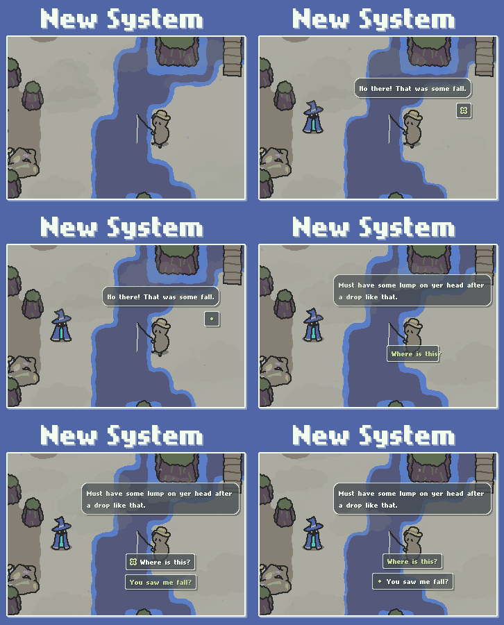
The main non-Kickstarter thing I've gotten done is the new dialogue system. Check out the upgrades in these before/after gifs!


Can you count all the changes? Here they are if not:
- Boxes position themselves dyamically, including leaving space around the speaker's 'speaking point' to keep their face visible.
- Boxes also grow/shift dynamically to match their live text contents, and some variants depending whether or not a given choice bubble is selected.
- The hardcoded "Q" icon has been changed to a keybind-agnostic icon that now represents "whatever you have bound to the Interact key".
- Choices are selectable by up/down selection rather than by specific bindings, allowing for controller support and for viewers on streams/videos to see what is actually being selected by the player
- Slight delays between each keypress with animated icons to add a little clarity around the conversation progressing and what you actually selected
- Sound effects! (not pictured here)
- And my favourite... animated 'speaking' lines! Those lines above Fishernut are generated dynamically, and can be tweaked in the future to have things like 'shouting' variants. For now, they just help clarify who's actually talking.
So, why this much change? The dialogue system worked okay previously, in that it was serviceable. But there were a few glaring problems that would have been time bombs had I tried to press on without addressing them. Mainly:
One, if I couldn't exert tighter control over their positioning, we'd run into some rough scenarios where it would be impossible to identify who's talking, either because the dialogue was too far from them or physically covering their face.
Two, the "Q/1/2/3/4" system was never really going to survive key rebinding work, much less the controller support work. The icons for each of those keys were just PNG files, and I didn't want to a button per-option, nor did I really want some options to be dynamic - if the player sets their Interact key from Q to Backspace, there's hardly room for all of "BACKSPACE" to fit in each choice bubble. I also knew one-key-per-option wasn't going to last forever since controller support is coming. One key to interact and two keys to shift selections was the way to go, and using a keybind-agnostic icon for "Interact" means I no longer have to worry about the impact of rebinding; I just have to put text somewhere else visible as a remind of what the interact keys are currently bound to.
For those reasons some degree of change was needed, but I didn't originally plan on a refactor. In the end, Godot's automated-positioning Control nodes are very handy for static UI, but in order to place things where I want, the refactor to just manually managing positions was required. Some conversations were already fairly awkward in terms of where the various dialogue bubbles appeared, and most of the QOL changes (as well as the general polish and swooshyness I tried to add in) just wouldn't have been possible - the Control nodes would have prevented me from manipulating them past what they felt comfortable doing.
(Those conversations where the textbox just continually rose higher and higher over the speaker? Also a Control nodes issue.)
That Kickstarter campaign, tho...

I crunched through all of the dialogue tasks basically in one day's worth of effort this weekend, with about 3 hours going into the speech line emitter (due to some frustrations with how Godot's Line2D points are accessed, grr) and 5 into the rest of the refactor. Even split up as 2 hours a night across 4 days, there's no way I could have actually gotten this done in that time broken up like that. I'd lose a lot of time to mentally getting back into the framework each night, and this has reminded me how much faster progress could be if I had the ability to work full-time...
So, once more - if you're interested in supporting the future Scrabdackle Kickstarter, please sign up for the mailing list on scrabdackle.com! It's the main platform I'm using to rally around right now, and it really, really helps if you join it.
Otherwise, as always we'd love to have you on the Scrabdackle Discord!
That's it til next time, thanks and bye!
Scrabdackle
A novice wizard explores a strange land.
| Status | In development |
| Author | jakefriend |
| Genre | Adventure |
| Tags | 2D, Action-Adventure, Boss battle, Exploration, Hand-drawn, Metroidvania, Pixel Art, Singleplayer, Top-Down, zeldalike |
| Languages | English |
More posts
- Scrabdackle is OUT NOW!19 days ago
- Scrabdackle: Act 1 announcement!May 01, 2025
- Fall 2023 and Winter 2024 double-updateJan 02, 2024
- The new 2022 demo is out!Sep 02, 2022
- May-June 2022 devlog! Ruining the Ruins 😎Jun 09, 2022
- April 2022 devlog - Visual leaps and bounds!May 03, 2022
- March 2022 devlog - Menus n' polish n' playtestingApr 01, 2022


Comments
Log in with itch.io to leave a comment.
Looking forward to it, the Linux demo ran so well and it's such a lovely gem. Will probably back it personally on KS :)
Thanks Liam! I'm so glad to hear your experience was so positive 😄