April 2022 devlog - Visual leaps and bounds!
Hello folks!
It's a new month, and time for a new devlog! I've split this one into two parts - the video part here, then a text part below.
Video topics (roughly in order):
- New Junk Heap visuals
- New 'Got Ability' event screen
- New save point visuals
- Changed magic casting system, and new attack spell visuals
- Updates to Save Select menu
- Music!
Crimson
The first Kickstarter NPC has been added to the game: Crimson! Crimson is a Major Character, and will be recurring throughout the game with their own character story. I've wanted major characters to be weaved throughout the game rather than just appearing in certain chunks of content, so they have an early optional event in the Junk Heap now!

It's also been a test of doing more of a "cutscene" scenario, which is tricky when the game involves player control at all times during dialogue. I think it's working okay? It does need some cleanup, though!
For these characters that extend the full game, writing their dialogue has been a bit tricky as the game is still non-linear, after all. Some of their more important moments are non-optional, but others, like this event, are - if you've already met Crimson and established a relationship with them elsewhere, it doesn't really make sense for this interaction to happen anymore, and a player could do this immediately after the tutorial or at the very very end of the game. It's tricky! I'm trying to plan ahead for that to make it less complex to figure out in the moment.
Music, in more detail
In the video, I mention that I've written about 30 minutes of music, which, uh - writing even 10 minutes in one month was a pretty big music month for me, in the past.
What I've actually completely started and finished:
- 4 character themes
- 4 region themes
What I've concept-started, but haven't finished yet:
- 3 combat themes
- 4 region themes
- 1 character theme
I can't show it all, especially not the incomplete stuff so far, but the game OST is trending to easily cross 2 hours in total! I've uploaded a few of the completed tracks here for your perusal, though!
Level editing conga
So, I've shown off my level editor before, and at this point it's pretty thoroughly tested and feature-complete.
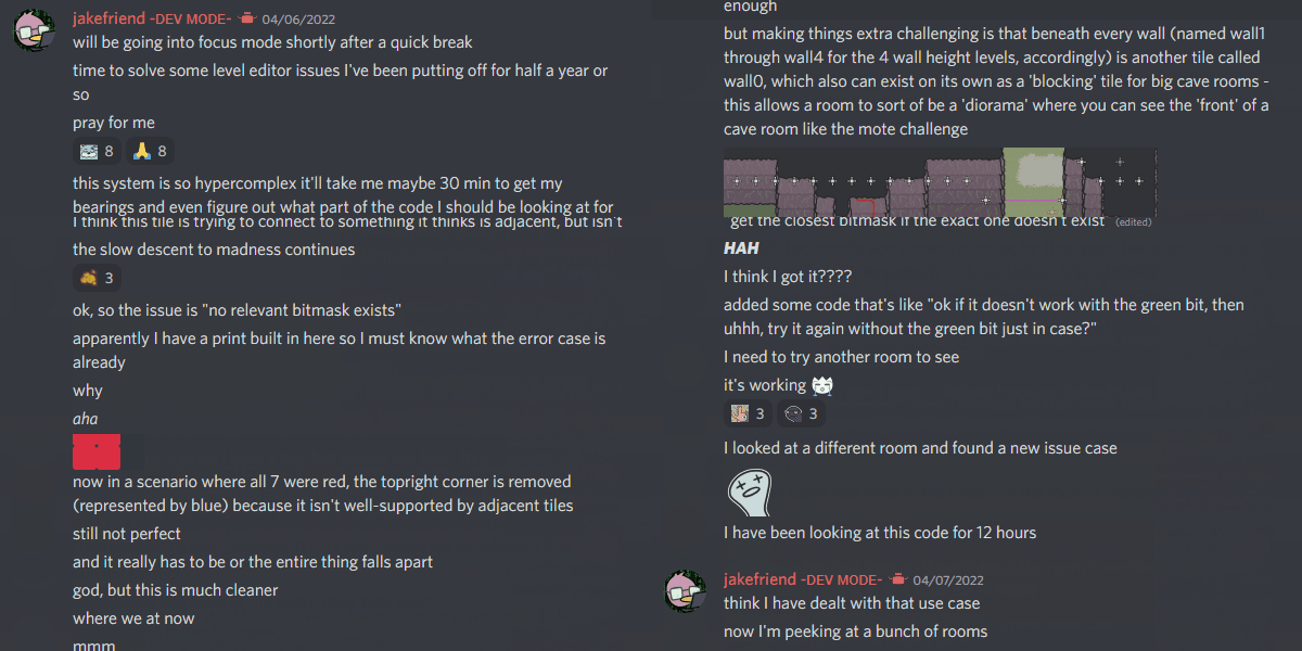
It's also one of the most daunting pieces of code that I've got - and one thing I had to fix, which unfortunately I couldn't just close my eyes and pretend to ignore, was this miniscule bug with how the level editor places tiles ever-so-slightly incorrectly, in infrequent and specific circumstances.
Basically, top-down-esque games with a "3/4 view camera" like mine often remove tall walls at the front/south part of the screen, while maintaining them along the back/north of the screen. In order to do that, in a regular game, you can simply place 'foreground' collision tiles along the bottom of the screen. But in my game, sometimes you can walk behind tall walls, so there actually need to be two types of 'tall wall' collision - one that's actually high up, and one that's actually 'on the ground' for the player's purposes. And what's more, despite technically not being adjacent to each other, they need to be told how to pretend to connect to each other to maintain the entire illusion.
It's a mess, honestly. It's hard to even explain. But it's really important to all this stuff working at all! And that means I had to wade back into the trenches of Old Code.

Here's 12 hours of me trying to fix one incredibly annoying, hyperprecise bug that basically breaks the visual illusion of the game if not dealt with.
That was a bad day! And I'm also not sure that I learned much that's applicable for the future - it's just a scenario that's inherently hypercomplex, and took over an hour to even get my bearings on the code enough to begin troubleshooting. And hey, I also took a brief break midway through and wrote an entire music track, so that's something.
I also took a timelapse of the first time I fully tested all of the new systems and visuals out together to recreate the room that's served as something of a test room! I'm really proud of how this one turned out - I think it sets the bar for what I want the rest of the game to hit, which is a long way from the visual quality of the demo :)
Save select design plan
In the video, I show off the save select submenus a bit - these are things that software like this just needs, unfortunately, even though I'm not personally, you know, that excited about menus? But nonetheless, I think I found a way to give a bit of life to them.
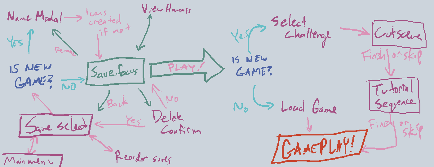
In trying to plan them out, I basically had to sketch out every possible state, and then an arrow of what states are possible to reach from that state. I don't manage the in-game code through a full state machine, but knowing my scope was pretty key to knocking this out relatively quickly (a day, maybe day and a half?)

Not 100% of this is done - I'm leaving the difficulty presets alone for now, as with the in-game achievements listings. But it's still a decent number of states when each requires its own 'thing'! And for what I haven't gotten to yet, I've planned ahead for and can use this image as a reference point for whenever I'm back revisiting it.
Misc
And here's stuff I can't otherwise categorize!
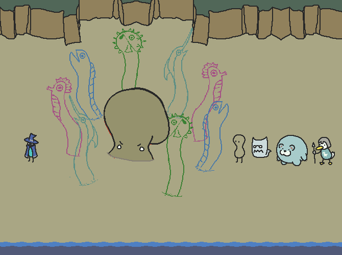
Serpenterf, a mid-game boss design! Still WIP, but I'm enjoying the spontaneous choice to give each tentacle a different 'fishy' head.

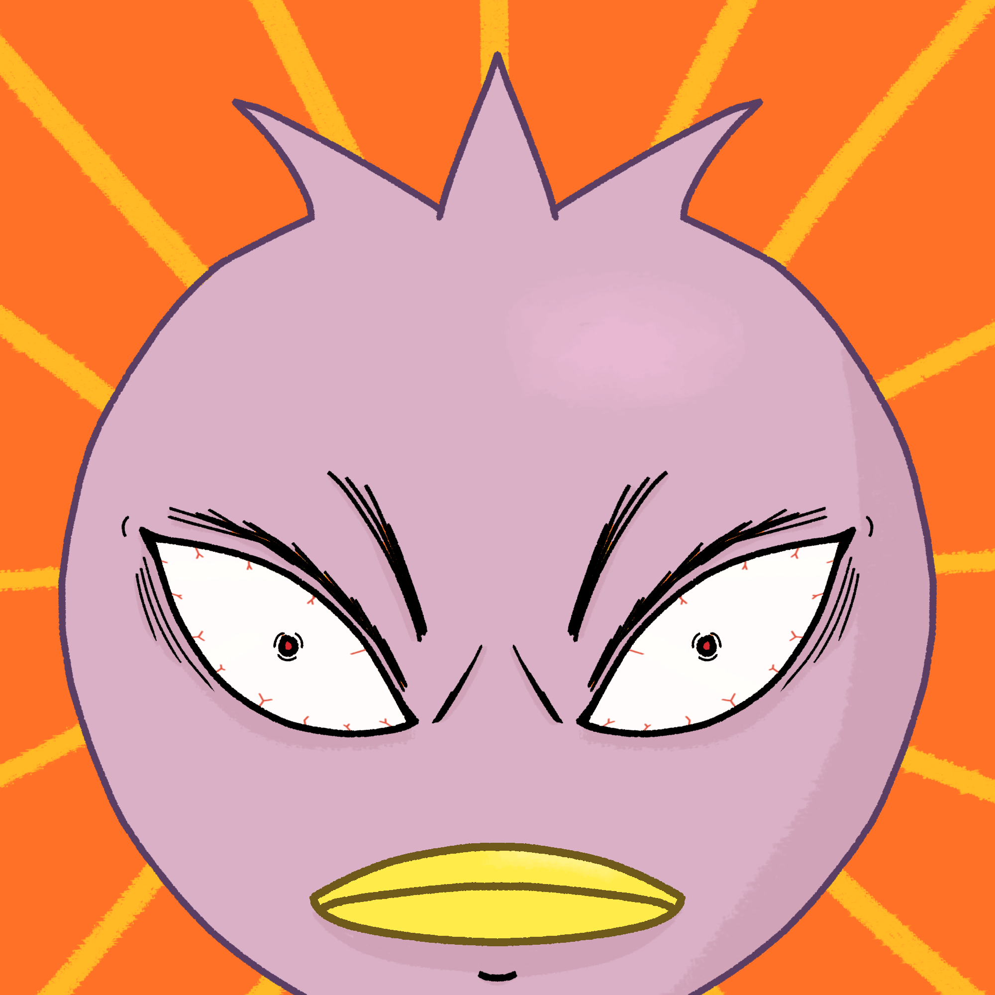
And here's all the types of 'got ability' colours I planned out, which I'll be using most of for various different abilities in the game. It's a small thing, and was quick to set up, but all these little touches go a long way when considered together :)

That's it for this month, see you next time!
Jake
Scrabdackle
A novice wizard explores a strange land.
| Status | In development |
| Author | jakefriend |
| Genre | Adventure |
| Tags | 2D, Action-Adventure, Boss battle, Exploration, Hand-drawn, Metroidvania, Pixel Art, Singleplayer, Top-Down, zeldalike |
| Languages | English |
More posts
- Scrabdackle is OUT NOW!13 days ago
- Scrabdackle: Act 1 announcement!May 01, 2025
- Fall 2023 and Winter 2024 double-updateJan 02, 2024
- The new 2022 demo is out!Sep 02, 2022
- May-June 2022 devlog! Ruining the Ruins 😎Jun 09, 2022
- March 2022 devlog - Menus n' polish n' playtestingApr 01, 2022

Comments
Log in with itch.io to leave a comment.
Hello! Nice looking game! Interesting visual idea! Desigh is cool! And very exciting video in YT! Well done!
Amazing!
0.o