Devlog, Jan 1 - Next flex? UX!
With great users comes great responsibility...
Time for U & I
After working hard on the lore system over the past two weeks, I realized I'd hit a road block. The next lore tasks involved having the book icon jump out of the sidebar and expanding to the full-size menu, and it wasn't going to work until the book icon was on the sidebar. Doing that meant tackling the final user interface design, which I'd intentionally put off until all systems were about done. And, as it turned out, all systems were about done.
...so I redesigned the entire user interface!

This all happened live on our Discord over a couple of streams, doing both the layout and concept (above) as well as the animation and polish work (below).
Some things you can briefly see on the gif there include me giving up on a vial rack for those pink vials (too visually obstructive/complex, and made it hard to read the vials), and attempting to turn the magic meter into a series of weird chemistry glassware things before (correctly) giving up on it for something else.
Let's talk about our changes.
Change #1: Health Vials
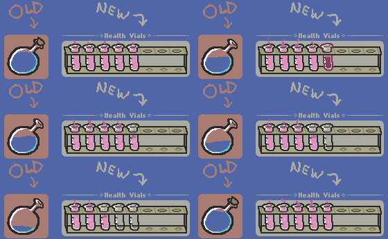
The former blue potion bottle is gone, replaced by a set of pink vials. The vials now represent a regular hit's worth of damage (with smaller hits being half a vial, and so on). Plain and simple, I loved the look of the old bottle, but it was a design failure. There's a variety of reasons behind this change, chiefly:
- It's no longer necessary to display a number to indicate health. Its fill level distinctions were very gradual and hard to count, plus it was very small for a critical UI element. 6 vs 8 HP remaining was mostly impossible to eyeball.
- Health is now scaleable. I originally planned for a smaller game, and for one without max health upgrades. I'm allowing for the health cap to be raised now, and can simply add vials when that happens.
- Confusion over health to hits is resolved. Since most hits deal 2 damage, the "10" max health from before was always really the original "5 hits" design, but allowing for half-power hits. This is masked by having a visual representation of 'hits' that don't equal 1. I was seeing this happen a lot on Let's Plays, with some players thinking they had 10 hits but dying after 5.
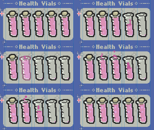
Something else new is uncorking. This is a tiny purely-aesthetic 'bragging rights' system, a visual cue for anyone trying to gauge how close a fight was. Notice how when you lose health, as soon as you need to use a vial for the first time it uncorks, then doesn't re-cork when you regain that health. The loss of cork represents that the hit was taken, even if you later found health pickups - only save point full heals will recork the vials.
Boiled down, that means: You want to prove you fought a boss hitless, even though it drops health mid-fight? If you kept all vials corked by the end of the fight, you've got those bragging rights! Or, you can see how close a fight was if the vials are all corkless.
This idea is closely tied to my decision to add max health upgrades - regardless of how much health you have, the player can still find motivation to take as few hits as possible, even if they have more breathing room.
Change #2: The Condenser
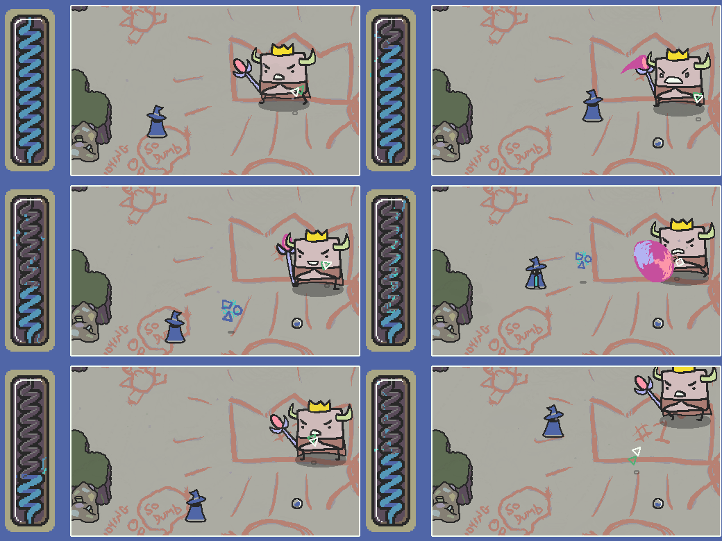
The condenser is the new 'magic meter' - formerly a horizontal glass vessel of liquid, and now a vertical coil within a glass vessel of sorta-liquid-sorta-electricity energy.
Changes here are more related to 'feel' than outright representation of the magic-regenerating mechanic. In the old system, you could generally tell if your meter was low or high, but it was impossible to really get granular, or have a sense of full-ness, which was the main problem. This version addresses this in a few small ways:
The zig-zag nature of the coil actually makes the meter about twice as visually long, since refills don't go just 'upwards' but back and forth horizontally while slowly filling vertically. It also provides visual separation of the bar, as it's no longer homogeneous but twisted along 10 coils. The front/back separation of colour in the filled coil also acts as a visual distinction. The coil animation also does this, as empty coils contract while newly-filled coils spring back to tumescence. This also helps clarify roughly how much magic was just used.
(Some SFX support will also help the player hear the coils refill, as well.)
Also in the 'feel' category is trying to make the idea of 'stored magic' seem less like a substance or chemical extract and more like... well, energy (albeit energy that happens to be contained). It crackles, bursts away when used, and generates like visualized static. More polish is still going to be added to the coil to have more flashes of colour and some random lightning sparks to also help sell this better.
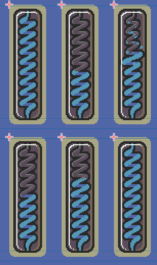
(this early mockup without the lightning shows the springing coils a little more clearly)
I thought about just breaking the meter into 10 small vessels, each representing 10% of the meter, which to be honest would I think make it clearer what the refill level was at - but for this element, having the player be able to easily tell the general idea of the meter was enough, and I liked this aesthetic a lot more.
The flip to the meter being vertical was done to get it closer to the player's eyeline - it's not as far from the gameplay window anymore now that it's vertically right alongside it.
Change #3: Spellcraft
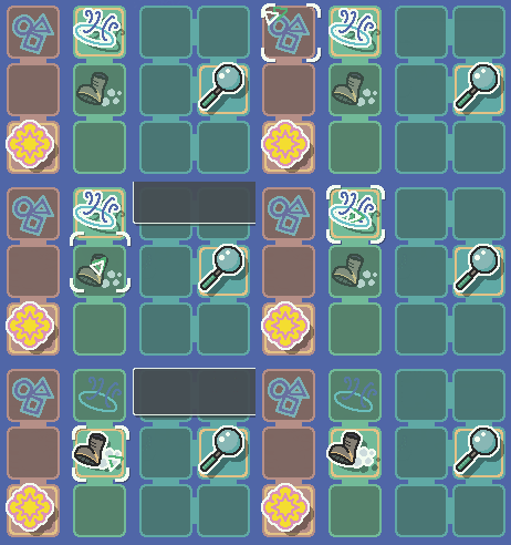
(ignore the grey boxes for a moment!)
The Spellcraft section is brand-new, and finally allows for swapping abilities on the fly witohut having to use the temporarily-fitted dev keys. Simply click the spell or magic power you wish to equip, and your current spell will swap out for the new one. Or, use other keys (or the d-pad, when there's controller support) to quick-select without taking your focus off the action!
Spells have always been planned to be quickly toggle-able, and were one of the main reasons I wanted to have an always-on-screen UI sidebar. What can I say other than that I just really like this? Radial menus that pop-up as needed or engine timescale changes to slow down the action to bullet time while making a decision are both really 'in' these days, but I don't really like either, and the radial is also challenging to convey with the different 'categories' of spell I want to have available.
The main design challenges here were surrounding showing a ton of information without it being too cluttered or overwhelming. I delved back into shaders to have the active icons pop 'out' with an outline, while inactive ones faded to the background a bit, and eventually the three separate colour categories felt a bit less distracting or overly-contrasting. I'll likely still play around with this, but the general idea and screen real estate are pretty committed-to.
Change #4: Tooltips!

This should be a huge headache-reducer for new players, or even non-new ones. I knew it wasn't super clear what elements in the UI were what before, but it would have been double the work to tackle that earlier and still do it now. Now that the sidebar layout is done, it was finally time.
The tooltips are going to vary by section - for Health Vials, it'll just tells you loosely what the vials represent, while for a given spell in Spellcraft you'll also see its cost and damage. I have more work to do here, as only one style (the generic one) is accounted for at present.
(The 'Stash' section you can see above isn't fully implemented yet, but will allow you to see a quick overview of key controls, your inventory of key items like stars and quest items, your bits, and your lore book.)
Let's talk releases.
Most of these changes were around specific design to communicate one thing or the other, but I also wanted the UI to just feel good and be interesting and enjoyable, so I'm really proud of how it all looks and works now!
UI has been a huge amount of work, as you might guess - I've had all winter break to really dig in and tackle a wide number of changes here, so although I won't be able to sustain that speed of development, I'm very happy with having it mostly behind me now. Next, I've got to finish up the tooltips, do some final polishing and SFX rigging of the existing elements, and then can get back to the lore work.
My overall goal at the moment is still to make release 06 focused around player experience, specifically to try and make it clearer and more enjoyable for let's players / streamers / other content creators. The press kit, really, was part of that too. Since the next 'update' doesn't have any content, I figure I might as well slowly layer it in - the sooner, the better, really, since it's all UX improvements.
The 06 release plan
I'm going to drop 06 in slices - one bit at a time. Here's what I'm thinking, generally in order.
- GUI redesign - within a week.
- Lore system's Scry spell and Grimoire - about a week after that, maybe more.
- It's mostly done, but I don't want to underestimate the page flipping shader work. There's also a moderate amount of writing still to-do for some entries.
- Wizard polish - hopefully not long after that, maybe another week?
- This is things like having the wand swish when you cast, making the walk animation read more clearly as 'in motion', and so on. Lots of things I honestly should have done ages ago but never thought it was worth prioritizing.
- The rest - TBD on timing.
- Keybinding options, some generators to decorate environments, various quality-of-life and aesthetic stuff like that.
After I'm at a stage I'm happy with when it comes to polishing - meaning a stage that's ready for the Kickstarter - I'll probably switch gears to focus on other KS prep (there's so much, so much). The final content pass will come during the Kickstarter itself, I'm thinking, as a way of continuing to drive engagement as the campaign drags on.
Okay, that's it from me for now, see you in another more-or-less week for hopefully an update announcement!
Discord link in the image! Have a click, we'd love to have you :)
Scrabdackle
A novice wizard explores a strange land.
| Status | In development |
| Author | jakefriend |
| Genre | Adventure |
| Tags | 2D, Action-Adventure, Boss battle, Exploration, Hand-drawn, Metroidvania, Pixel Art, Singleplayer, Top-Down, zeldalike |
| Languages | English |
More posts
- Scrabdackle is OUT NOW!14 days ago
- Scrabdackle: Act 1 announcement!May 01, 2025
- Fall 2023 and Winter 2024 double-updateJan 02, 2024
- The new 2022 demo is out!Sep 02, 2022
- May-June 2022 devlog! Ruining the Ruins 😎Jun 09, 2022
- April 2022 devlog - Visual leaps and bounds!May 03, 2022
- March 2022 devlog - Menus n' polish n' playtestingApr 01, 2022

Comments
Log in with itch.io to leave a comment.
Great stuff!
Love all the GIFs, and lovely work on the redesign! :)
looks good cant wait for the update