How I animate characters (part 1)
Initially this was just a one-off reddit post, but since it was well received, I wanted to bring it here and consider doing more in the future as well. We're going to be looking at a new enemy for the Rubble Ruins area, the Grinble.

So, this was written as a guide hoping to be helpful to others out there like me. I have exactly one art skill - I can doodle okay - but otherwise don't have much natural ability to create quality art. I work with a style that leans into my strengths (thick-line pixel art with flat colour blocking), but wanted to share how I create dynamic animations in spite of limited ability, without taking tons of time.
If you have serious art chops, this is probably not how you do things, but I hope it helps others in my position as I find a lot of tutorials for how to draw things unintentionally take a lot of 'fundamental art skills and senses' for granted.
The tl;dr is: Don't start out trying to draw something good. Start with something bad and quick, then good-ify it piece by piece. Break each thing you can't do into smaller pieces you can. Yes, this sounds obvious, but it's really hard to shake the need to make something 'right' when sketching without consciously keeping in mind that doing it wrong first is a right way to do it.
1. Draw the rough idea-- badly.
Most of my on-paper sketches are... not good. That's okay. That's what your computer's for, later.
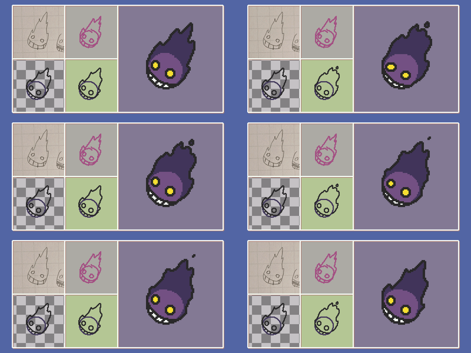
The importance of the paper sketch is to communicate the idea of the character. Here, I wanted to have some kind of 'evil fireball' character that could be floating. I've kept it (extremely) simple - it's.. a fireball with a face. I like the empty stare eyes and the huge grin that seems to start from somewhere under the character, so it's enough to get started. By doing this step, I know the general idea of what I want.
2. Sketch the elements on your drawing program, to scale-- badly.
Again, I'm not concerned about quality yet. The importance of this step is scale. This rough sketch helps make sure my later, higher-effort product isn't too big or small when actually placed in-game. It's pretty disheartening to turn out a great animation only to realize it's not the 'right' size, and you usually have to more or less start over.
So, I start with the biggest shape: the fireball silhouette. I get an in-game screenshot and draw it next to the player character (for me, drawing against a game still is really important to start). I do it a few times until the scale feels right - and this is a throwaway sketch, so I could have even used the resize tools, because it's only a reference.
The fireball's in place, so I place the rough face, and also decide that I like the idea that there's actually some 'inner ball' body that itself is on fire. I draw that too, why not. This whole process has only taken a few minutes from when I opened Aseprite. By doing this step, I have a to-scale reference for the entire rest of the animation process.
3. The first 'real' drawing. Still okay if it's rough.
Using your reference sketch, start to draw 'real' elements step by step. (Personally I am a layer fiend and I use separate layers for everything.)
I know I have to draw a ball body, eyes, the grin, and the flame. I do the ball body first, and basically this is me drawing circles and ctrl-Zing rapidly until I have one I like. It looks good because I spend a full minute killing 50 attempts that don't look good.
Next the grin, because I know it extends from the bottom of the body, so it's just a curved line for the top of the mouth then some cross lines for teeth. Then the eyes. Again, I'm just rapidly drawing the same lines over and over until they don't look like garbage.
Finally, the hard one - the fire. I'm intimidated by drawing fire, so I left this for last. I can't draw this well no matter how many times I ctrl-Z retry, since it's more than just a simple shape/line, so I accept a bad one as a starting point. By doing this step, I have all the simple elements I need, and have a starting points for the complex ones.
4. Work on a test animation. Let it change your initial sketch.
I've still got a bad fire shape that I want to turn into a good one. The solution? Draw more bad fire shapes, as an animation.
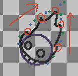
I want this animation loop to be short (partly so it'll "burn fast", and partly because... short means fewer frames to animate!). I go with 3 frames. Then I mark out the flame 'points'. This is a super critical step because it helps me bridge the gap of "how do I do this though" - up until this point, I've been bluffing myself, and I still don't know how I'm going to approach the fire at all.
So, since it's too big a challenge for me, I break down the problem into smaller tasks.

Check out the points in that image. I figure: 3 frames to work with, and my fireball has pointy bits, and I want the pointy bits to 'move back' from the ball body towards the end of the flame's tail. I mark the current points in red. I roughly imagine the points moving over the 3 frames, so that each red point has become the next red point 3 frames from now. Then I mark two points in between each red one. I figure this is where I'll roughly have to make the flame tips move over the next two frames. I also mark two points near the bottom of the body where flames will have to start from, and two points at the end of the tail where a piece of flame might 'break off' when the left and right sides merge. I've picked my points more or less randomly; it matters more to have a rough sense than precise markers.
So, I repeat the previous step's approach to a fire body two more times, on different frames, and this time with my point-reference. I'm still not happy with the results yet, but I'm still taking it step by step. And now that I've drawn my next two frames, I can take a step back and assess specifically what's not working:
- 3 frames is probably not enough - it's too rapid and jerky.
- Most of the flame tips don't look great. The lines end up having sharp corners I don't want, and lots of lines go directly up/sideways, which takes away from that organic feel I like.
- There's some really jerky bits where the flame is 'out' one frame, then 'in' the next, and it looks like something took a bite out of it between flames. Too big a jump.
...Which is great! Now I know exactly what I need to do to make this not suck.
5. "Make it not suck!" (...by taking it one task at a time)
This might feel like a "draw the rest of the owl" moment. But it shouldn't be - I know what's not working, which means I can do this as tasks. I am exactly focused on each of the 3 problems I outlines above.
First, I draw one more frame and see if 4 frames looks like it's enough. It does. Cool. This has the added benefit of giving me a chance to deal with those big jerky jumps in the flame position, by making my new frame 'bridge the gap'. Great, that solved 2 problems in one.
By this point, I have an animation where I'm happy with the movement of it, but unhappy with each individual frame. The last step is just gruntwork - I tackle each flame tip one by one in each frame, trying to make them less sharp and more curling. It's honestly just me playing with moving pixels around, and takes the most time out of any of the steps. If a line's too straight, I break it. If there's not enough space to 'see' the curl, I move the fire body in. If the curl's too sharp, I take out some edge pixels. (That's about as much detail as I'm equipped to go into; I'm no fire expert and I'm just trying to generally describe a process of identifying things that don't seem to be working and changing them until the greater scope starts to look better).
Now I like the fire. Only after every single other element was in place was tackling the fire even possible for me to start, though.
Further polish / The end.
Everything else I worked on the same way - one step at a time, breaking hard tasks into smaller/easier ones. I give the eyes a little life by moving them up and down in a bunch of different timings and try to give them some bounce. It just takes a bunch of tries, and I double the flame animation to 8 frames (4 repeated twice; I'm not drawing that fire again!) to give the eye animation more time to breathe. I move the grin up and down a bit as well, colour in the shapes, and give the ball body a little bit of flicker so nothing looks static.
At the end of the day - I could NEVER have 'just drawn' the final image to start with. I wouldn't have at all known what I was doing. Taking it many steps at a time and being okay with all the elements looking bad at first are what help me overcome those hurdles.
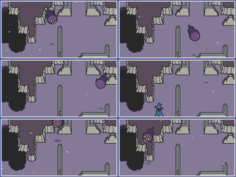
Anyway, I hope this was helpful to some of you out there, and thanks for reading! Happy to talk more here in the comments, or in our Discord server. Here's a final gif of a Grinble chasing me around the ruins:

All animations and art for Scrabdackle are done with Aseprite, which I highly recommend.
Scrabdackle
A novice wizard explores a strange land.
| Status | In development |
| Author | jakefriend |
| Genre | Adventure |
| Tags | 2D, Action-Adventure, Boss battle, Exploration, Hand-drawn, Metroidvania, Pixel Art, Singleplayer, Top-Down, zeldalike |
| Languages | English |
More posts
- Scrabdackle is OUT NOW!12 days ago
- Scrabdackle: Act 1 announcement!May 01, 2025
- Fall 2023 and Winter 2024 double-updateJan 02, 2024
- The new 2022 demo is out!Sep 02, 2022
- May-June 2022 devlog! Ruining the Ruins 😎Jun 09, 2022
- April 2022 devlog - Visual leaps and bounds!May 03, 2022
- March 2022 devlog - Menus n' polish n' playtestingApr 01, 2022

Comments
Log in with itch.io to leave a comment.
ok now this is epic
yea
this will be awesome
can't wait for a... you stopped reading, did you?
Did I? 🤔
it was a joke about long badly spelled passages. i see them a lot on youtube!